By Angela Bandurka
Claude Monet was clearly a master painter. But one of the things I appreciate most about his work is the way he used colour and value - it's brilliant!
Today in my Fume Free Oil painting class, I talked to my students about how colour can trick your eye into seeing values wrong. Remember, value refers to the difference between dark and light.
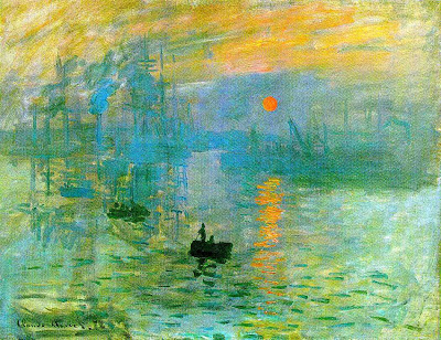
Monet gives us a perfect example of this in "Impression, Sunrise."
 |
| Impression, Sunrise Claude Monet, 1873 |
This painting has some vibrant blues, greens, yellows and oranges in it. The fiery rising sun pops out at you. Your eye might think that the sun is lighter than the sky around it... but it's not.
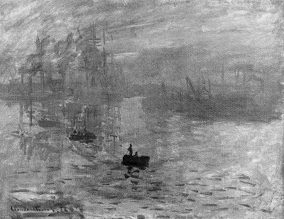
As you can see in the black and white version, the sun virtually disappears!
 |
| Impression, Sunrise - in black and white |
It's like magic.
Why does this matter?
It can really help you when you feel like something is just not working in your painting to revisit your values.
It can really help you when you feel like something is just not working in your painting to revisit your values.
Use a photo editing software like iPhoto, Photoshop, or others, to turn your resource black and white. Then it'll be more clear to you where your darkest darks, lightest lights, and mid-tones should go.
And don't forget that you can exaggerate them, too! As artists, we have tools in our "toolbox" that we can employ to imply a 3D scene on a 2D surface.
Here are some of mine: (these rules can be broken, but they are usually true and very helpful):
Here are some of mine: (these rules can be broken, but they are usually true and very helpful):
- VALUE: Darks approach, Lights recede. Things that are closer to you are darker - so your shadows in the trees that are right beside you are going to be much darker than the shadow in the trees 100 feet away.
- PROPORTION: Objects get larger as they get closer to you and smaller as they move farther away. That's why the road gets narrower and narrower as it goes off into the distance until it becomes a spec.
- SATURATION: Colors are brighter and have more yellow in them than colors that are in far away objects. Think of distant mountain ranges. They might be full of green trees, but they still look blue and pale. Distant objects are usually greyer and blue/purple-ish. That's because of the atmosphere, which usually drops the color yellow first in the spectrum, followed by others one by one.
- DETAIL: Objects that are closer are gonna have more detail - but as an artist you can determine where you want the eye to go first and be more detailed in that area. So you can fudge this one a little (think of how a camera lens can do this for you - now do it for yourself in your work!)
